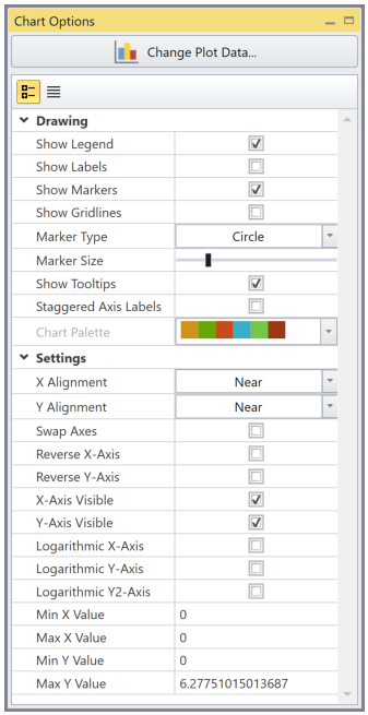
Chart Options
Chart options allow the user to adjust the chart appearance
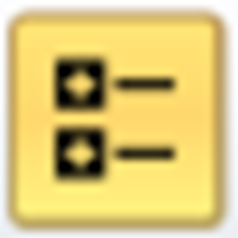 Icon organizes options into categories
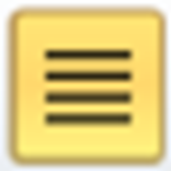 Icon condenses options without categories
 |
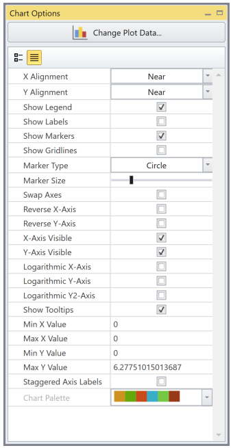 |
Drawing Options
- Show Legend: toggles display of legend which shows the data series and its corresponding colour and symbol for the chart.
- Show Labels: toggles display of exact data information on each data point.
- Show Markers: toggles display of marker symbols to define each data point.
- Show Gridlines: toggles display of grid lines in the chart
- Marker Type: changes symbol used to represent each data point
- Marker Size: changes symbol size that represents each data point
- Show Tooltips: toggles by hovering mouse over data points will show additional information
- Staggered Axis Labels: Shift neighboring axis labels to reduce overlap and make the axis more readable.
- Chart Palette: Colour set used for data series
Settings Options
- X or Y Alignment: Choose the location of the axis
- Swap Axes: Change which data type is the vertical and horizontal axis
- Reverse X-Axis or Y-Axis: By default, the data is sorted from smallest to largest from either left to right or bottom to top where the origin is on the bottom left corner. The Reverse option will flip the sorting arrangement, such that smallest to largest becomes either right to left or top to bottom.
- X-Axis or Y-Axis Visible: toggle visibility of an axis
- Logarithmic X-Axis or Y-Axis: changes axis to be shown in a logarithmic scale.
- Min and Max X Value: adjust minimum and maximum range of the X axis
- Min and Max Y Value: adjust minimum and maximum range of the Y axis
The chart will visibly restrict the maximum and minimum displayed such that it does not exceed a 10% difference in the range (maximum - minimum) of the actual values for either axis.
Change Plot Data
Depending on if Graph Data or Graph Data (Multiple Panel) is chosen Change Plot Data will display different options. On the top bar of Chart Options, use the Change Plot Data option ![]() to open the Chart Options dialog for the following settings:
to open the Chart Options dialog for the following settings:
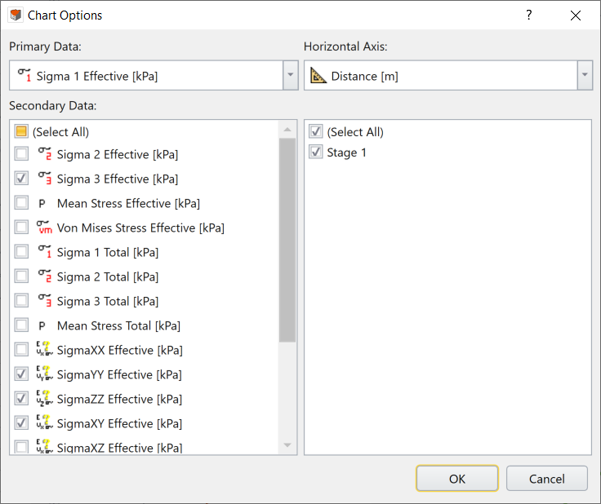
Graph Data
A single graph will be display when Graph Data is chosen
- Primary Data: Set main data of interest which is the vertical axis by default.
- Secondary Data: Add additional data of interest plotted with the primary data.
- Horizontal Data: Set data in which primary data is plotted with respect to.
- On the bottom right, set the stages to be plotted.
- For multi-staged models, stage number or stage time (for time-dependent analysis) can be chosen under the Horizontal Axis. This allows the tracking by stage (for transient water flow or settlement under consolidation).
- For plots with the horizontal axis set at stage number for a SSR analysis, the data of all stages with SRF values will be plotted incrementally at the end of the analysis.
- For plots with the horizontal axis set at stage time for a SSR analysis, the data of all stages with SRF values will be plotted with the same time equal to that of the end of analysis.
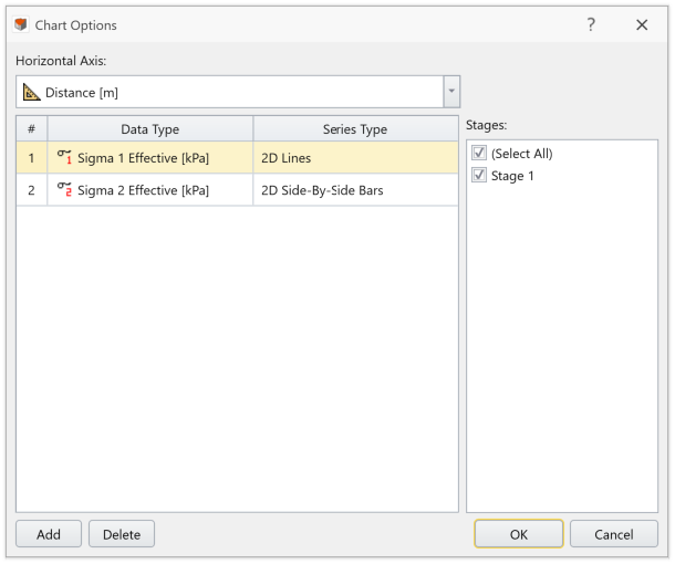
Graph Data (Multiple Panel)
A multiple graphs will be display when Graph Data (Multiple Panel) is chosen
- Primary Data: Set data types of interest which are the vertical axis by default.
- Data Type: Set the data type of interest to be plotted. Graphs can be added or removed using the Add and Delete button
- Series Type: Control how the data will be displayed for a data type
- Horizontal Data: Set data in which primary data is plotted with respect to.
- On the bottom right, set the stages to be plotted.
- For multi-staged models, stage number or stage time (for time-dependent analysis) can be chosen under the Horizontal Axis. This allows the tracking by stage (for transient water flow or settlement under consolidation).
- For plots with the horizontal axis set at stage number for a SSR analysis, the data of all stages with SRF values will be plotted incrementally at the end of the analysis.
- For plots with the horizontal axis set at stage time for a SSR analysis, the data of all stages with SRF values will be plotted with the same time equal to that of the end of analysis.
Plot in Excel
- The Plot in Excel
 option launches the Microsoft Excel program automatically, and plots the current chart and data in an Excel file.
 - This option can be selected from the Chart menu, toolbar, or by right-clicking on the graphs.
- If multiple curves are plotted they will be exported to one Excel sheet in separated columns.
- The Excel file does not save automatically and must be done manually.
User must have a valid Excel program, otherwise this feature won't work