Graphing Line and Liner Line Queries
A Line Query or a Liner Line Query displays the current data type selected in the Legend. To graph Line Query (or Liner Line Query) data:
- Select the Line Query (or Liner Line Query) entity from the Viewports or the Visibility Pane.
- Select Graph Data in the Properties Pane. Alternatively, the user can select: Interpret > Graph Data.
- The selected data will be plotted for all query points in a new Chart View tab.
- Use the Copy Data to Clipboard
 option from the Chart menu, toolbar, or by right-clicking the chart to extract all query data to the Windows clipboard. Users can paste the data to Excel for further analysis.
 - Use the Plot in Excel
 option from the Chart menu, toolbar, or by right-clicking the chart, to export the current chart with data in Excel. The Microsoft Excel program will automatically be launched. See more details in the Chart Options section.
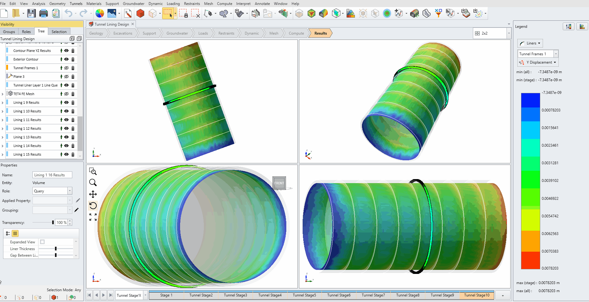
An example is shown below. A liner line query has been created around the circumference of the tunnel. The y displacement of the liner along the query is graphed and plotted in Excel. Data is from stage 7 to stage 10. The example is taken from the RS3 Tutorial - Liner Local Coordinates.
User must have a valid Excel program, otherwise this feature won't work