Cumulative Plot
A Cumulative Distribution is, mathematically speaking, the integral of the normalized probability density function. Practically speaking, a point on the cumulative distribution gives us the probability that a random variable will be LESS THAN OR EQUAL TO a specified value.
That is, if (X, Y) is a point on the cumulative distribution S-curve, then Y = the probability that the random variable will be <= X.
To plot a Cumulative Distribution after a Probabilistic Analysis:
- Select Statistics > Cumulative Plot

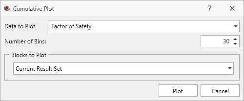
- In the Cumulative Plot dialog:
- Select the Data to Plot. The following data can be plotted:
- The Factor of Safety, Weight, Required Support Pressure, or Failure Depth, for any analysis method which was used (these will be listed first before the input data Random Variables).
- Any Random Variable that you have defined for the Probabilistic Analysis (these will appear after the pre-defined data types in the drop-down list of Data to Plot).
- Select the Data to Plot. The following data can be plotted:
- The Number of Bins used to create the plot can be customized if desired.
- Select Blocks to Plot. The following blocks selection options are available:
- Current Result Set: the blocks included in the active Results Set (i.e., All Valid Blocks, Removable Blocks, Failed Blocks).
- Filtered Blocks: the blocks included in the current filter.
- Single Block: a single block given by the Block ID.
- Select Plot button to generate the cumulative plot.
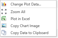
Right-Click Options
Other options are available if you right-click on a Cumulative Plot. For example:
- Select the Change Plot Data option to change the data viewed on the plot.
- Plot in Excel: you can either right-click a chart or click the 'export to excel' button Plot in Excel
 button in the toolbar. An Excel application will open and the data will be exported in columns. A chart object duplicating what was in the RocSlope3 will also appear.
 - Copy Chart Image: this allows you to copy and paste the chart as an image.
- Copy Data to Clipboard: this allows you to copy and paste the data to other spreadsheet or word file.
Experiment with the different options available in the right-click menu.
Chart Options
The Chart Options pane on the left side allows you to modify the graph with the drawing/settings of the plot. The drawing section allows you to change the labels while settings allow you to adjust the graph settings such as axis alignment, min/max, etc.