Scatter Plot
A Scatter Plot allows you to plot any two variables (Random Variables or computed data types from a Probabilistic Analysis) against each other on the same plot. Typically, the Scatter Plot is used to plot computed data (e.g., Factor of Safety) versus an input data Random Variable, to observe the correlation between the two.
To create a scatter plot:
Select the Results node in the Visibility Tree and in the Properties pane, set Block Type Unit Blocks to see the probabilistic results of unit blocks or Block Type = Combined Blocks to see the probabilistic results of combined blocks.
Scatter Plot is not available when Block Type = Unit and Combined Blocks.- Select Statistics > Scatter Plot

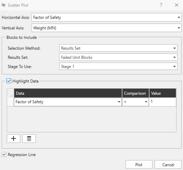
- In the Scatter Plot dialog:
- Select the data you would like to plot on the Horizontal Axis and the Vertical Axis. The following data can be selected for either axis:
- The Factor of Safety, Weight, Required Support Pressure, Failure Depth, or Excavation Face Area for any analysis method which was used (these will be listed first before the input data Random Variables).
- Any Random Variable that you have defined for the Probabilistic Analysis (these will appear after the pre-defined data types in the drop-down list of Data to
- In the Blocks to Include section:
- Select the Selection Method. The following blocks selection options are available:
- Results Set. If Block Type = Unit Blocks, then the Results Set options are: Failed Unit Blocks, Removable Unit Blocks, All Unit Blocks, Excavation Unit Blocks. If Block Type = Combined Blocks, then the Results Set options are: Removable Combined Blocks, Failed Combined Blocks.
- Single Block: a single unit or combined block (corresponding to the selected Block Type in the Properties pane) given by the selected Block ID.
- Currently Visible Blocks (Filtered Blocks): the blocks currently visible in the viewport, determined by the current filter.
- If Selection Method = Results Set, then you also need to specify the Stage To Use.
- Select the Selection Method. The following blocks selection options are available:
- You can choose to highlight data on the plot, according to user-defined criteria, by selecting the Highlight Data checkbox, and defining your criteria. See below for details.
- Select the Regression Line checkbox to fit a best fit line through the data set.
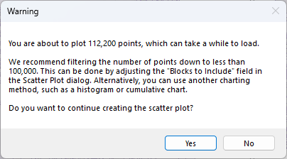
- Click the Plot button to generate the scatter plot.
- Select the data you would like to plot on the Horizontal Axis and the Vertical Axis. The following data can be selected for either axis:
Highlight Data
The Highlight Data option for Scatter Plots works in the same manner as described for a Histogram Plot (see the Histogram Plot topic for details). On a Scatter Plot, when data is highlighted, the data points will be displayed as different colours with a legend indicating the highlighted data on the plot.
Correlation Coefficient
The Correlation Coefficient indicates the degree of correlation between the two variables plotted. The Correlation Coefficient can vary between -1 and 1, where numbers close to zero indicate a poor correlation, and numbers close to 1 or -1 indicate a good correlation. Note that a negative correlation coefficient simply means that the slope of the best fit linear regression line is negative.
Alpha and Beta
Alpha and Beta represent the y-intercept and slope, respectively, of the best fit linear Regression Line to the scatter plot data. The display of the linear regression line can be toggled on or off by selecting the Regression Line option in the right-click menu.
Right-Click Options
Other options are available if you right-click on a Scatter Plot. For example:
- Select the Change Plot Data option and the Scatter Plot dialog will appear, allowing you to change the data viewed on the plot.
- Select Highlight Data Only to see only the highlighted data on the graph.
- Select Regression Line to view/hide the regression line.
- Plot in Excel: you can either right-click a chart or click the Plot in Excel
 button in the toolbar. An Excel application will open and the data will be exported in columns. A chart object duplicating what was in the RocTunnel3 will also appear.
 - Copy Chart Image: this allows you to copy and paste the chart as an image.
- Copy Data to Clipboard: this allows you to copy and paste the data to another spreadsheet or word file.
Experiment with the different options available in the right-click menu.
Chart Options
The Chart Options pane on the left side allows you to modify the graph with the drawing/settings of the plot. The drawing section allows you to change the labels while settings allow you to adjust the graph settings such as axis alignment, min/max, etc.