8 - Probabilistic Analysis Tutorial
1.0 Introduction
This tutorial will demonstrate how a probabilistic analysis is performed in Slide2. We will specify statistical input properties for the slope materials to determine the uncertainty effect on slope stability.
We will interpret the following results from the probabilistic analysis:
- Deterministic safety factor
- Mean safety factor
- Probability of failure
- Reliability index
We will also interpret probabilistic results using histogram, cumulative, scatter and convergence plots.
Finished Product
The finished product of this tutorial can be found in the Tutorial 08 Probabilistic Analysis.slmd data file. All tutorial files installed with Slide2 can be accessed by selecting File > Recent Folders > Tutorials Folder from the Slide2 main menu.
2.0 Model Geometry
This tutorial will be based on a simple model with its deterministic material properties already defined.
- Select File > Recent Folders > Tutorials Folder from the Slide2 main menu and open the Tutorial 01 Quick Start.slmd file.
- Right click on the Group 1-Master Scenario and Add a Scenario

- Rename the Scenario 1 as ‘Global Minimum’.
2.1 Project Settings
In Slide2 a probabilistic analysis can be carried out using either the Global Minimum or the Overall Slope options. We will use Global Minimum in this tutorial.
When the Analysis Type = Global Minimum, this means that the Probabilistic Analysis is carried out on the Global Minimum slip surface located by the regular (deterministic) slope stability analysis.
The safety factor will be re-computed N times (where N = Number of Samples) for the Global Minimum slip surface, using a different set of randomly generated input variables for each analysis.
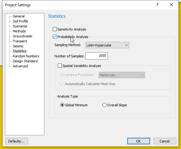
The Probabilistic Analysis option must be set in the Project Settings dialog in the following manner:
- Select Global Minimum scenario and go to Analysis > Project Settings

- Select the Statistics tab on the left side of the dialog and tick the checkbox beside Probabilistic Analysis.
- Select the following analysis options:
- Sampling Method: Latin Hypercube
- Number of Samples: 1000
- Analysis Type: Global Minimum
- Click OK to close the dialog.
The selected options mean that safety factor values will be computed 1000 times for only the Global Minimum slip surface (determined from a deterministic analysis), using a different set of randomly generated input variables for each new run.
We will examine Spatial Variability Analysis in the Slide2 Tutorial: Spatial Variability.
Notice that the Statistics menu option is now available in the Slide2 menu. This option will allow us to define any model input parameter as a random variable.
3.0 Defining Random Variables
For this tutorial, we will define Random Variables for cohesion, friction angle and unit weight for the slope material.
- Select Statistics > Materials
 in the menu.
On the Material Statistics dialog, we will define random variables for “Soil 1”.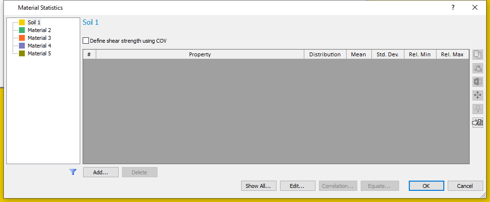
- Click the Add button and select the material properties (Cohesion, Phi and Unit Weight) to be defined as Random Variables on the resulting dialog. (Alternatively, you can use Edit button, on the Material Statistics dialog.)
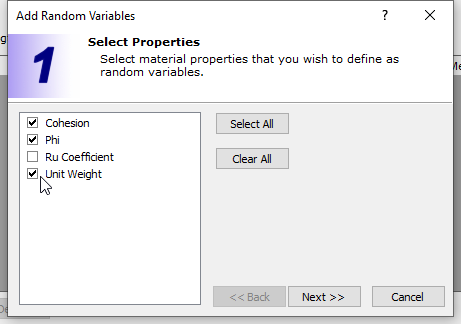
- In the Add Random Variables dialog, click Next
and use the default statistical distribution – Normal distribution.
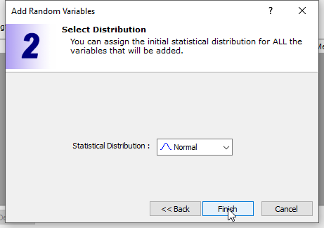
- Click Finish to close the dialog.
The Material Statistics dialog will now display the material properties which we selected as Random Variables in a grid on the dialog.
To complete the statistical distribution of each random variable, we must specify the Standard Deviation, Relative Minimum and Maximum values for each variable.
- The Relative Minimum and Maximum values are distances measured from the Mean Value. These are used to bound the distribution on either side.
- For a NORMAL distribution, 99.7 % of all samples fall within
distances of 3 standard deviations to either side of the mean.
Therefore, if you don’t want to truncate the distribution, the Relative
Minimum and Relative Maximum values can be set to at least 3 times the
standard deviation, to ensure that we minimize our truncation of the
normal distribution. This can be done automatically using the button on
the right-hand side.
- For each variable, enter the Standard Deviation, Relative Minimum and Relative Maximum values shown in the table below. After inputting the standard deviations, the relative minimum and maximum data can be entered by selecting the rows and clicking the 3x standard deviation button .
Mat. Property |
Std. Dev. |
Rel. Min |
Rel. Max |
Cohesion |
1 |
3 |
3 |
Phi |
3 |
9 |
9 |
Unit Weight |
0.5 |
1.5 |
1.5 |
As an example, this means that the lowest cohesion value which can be sampled is 2 kPa (mean – rel. min = 5 – 3 = 2) and the largest value is 8 kPa (mean + rel. max = 5 + 3 = 8).
Your material statistics dialog should look like the image below when you are finished.
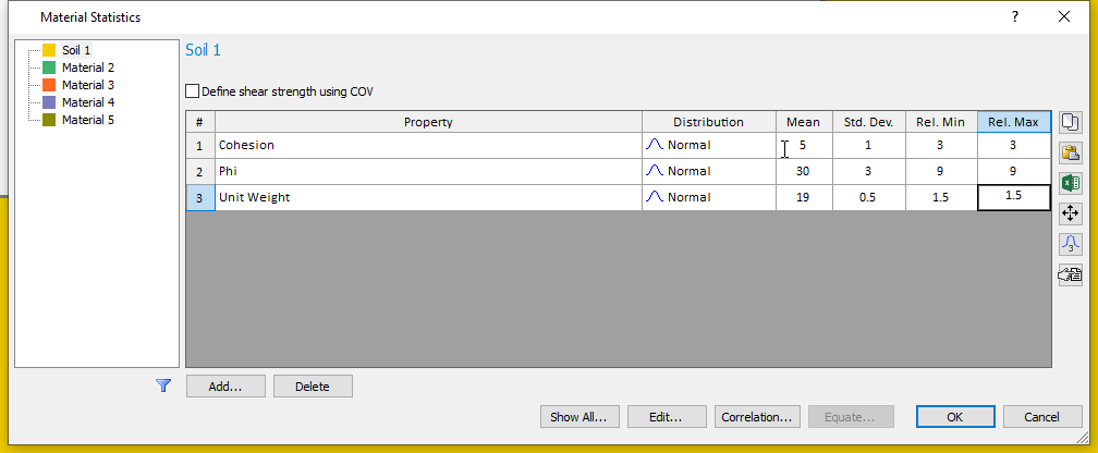
- Click OK to close the dialog.
We have defined our statistical parameters and will now run the probabilistic analysis.
4.0 Computation and Interpretation
- Select Analysis > Compute
 to run the analysis.
 - Select Analysis > Interpret
 to view results when computations are done.
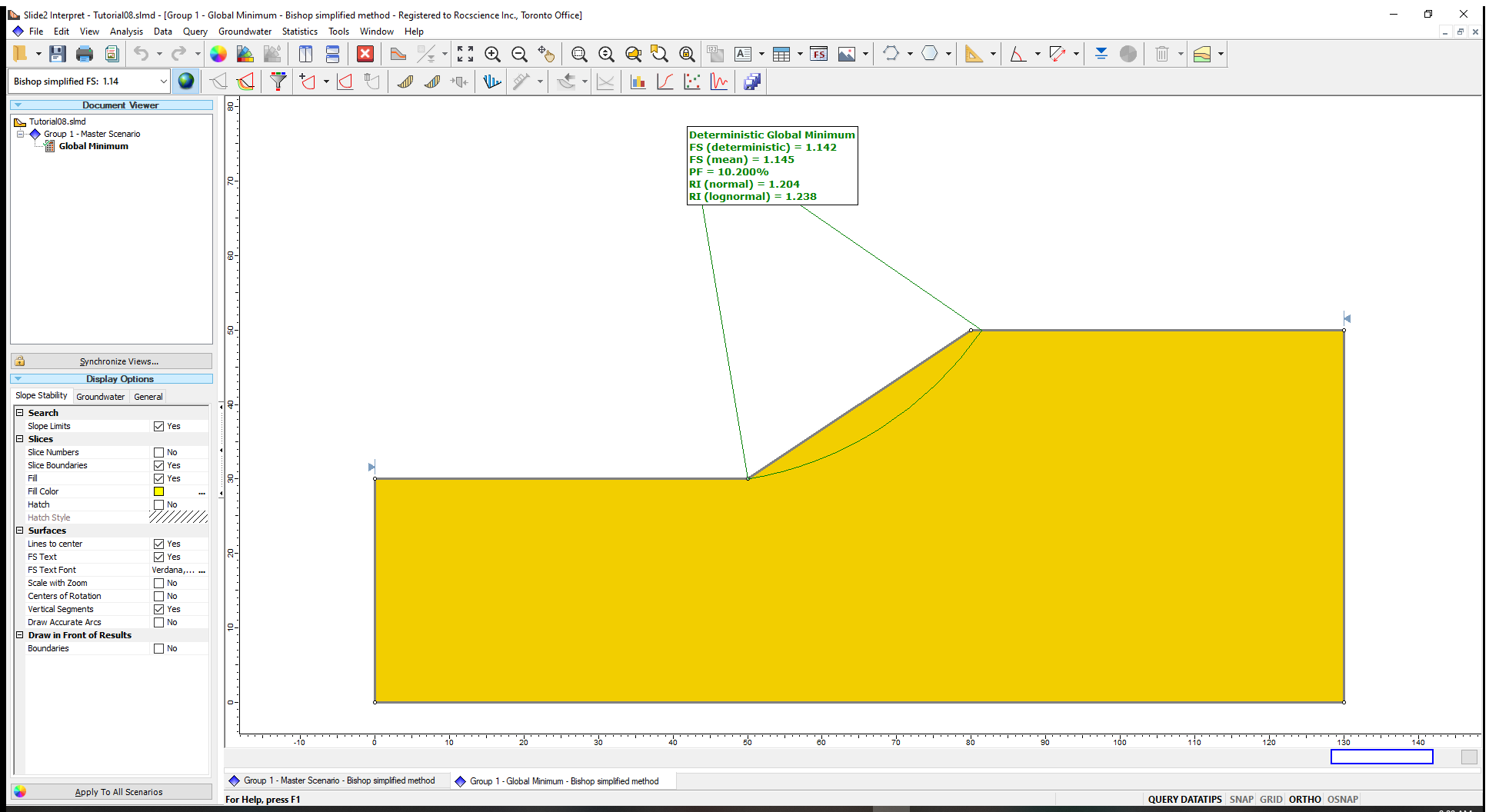
The following results will be displayed on the model when computations are done:
- FS (deterministic) or Deterministic Safety Factor is the safety factor of the Global Minimum slip surface, from a regular (non-probabilistic) slope stability analysis.
- FS (mean) or (Mean Safety Factor) is the average safety factor of the Global Minimum slip surface obtained from the probabilistic analysis.
- PF or (Probability of Failure), which estimates the failure risks of slopes, is the ratio of the number of samples with safety factor of less than 1 to the total number of samples.
From our tutorial results, a PF of 10.2% means that out of the 1000 samples analyzed, 102 slip surfaces produced safety factors less than 1.
- The Reliability Index (RI) indicates the number of standard deviations that the mean safety factor is away from the critical safety factor value of 1. It can be calculated assuming either a normal distribution (Normal RI) or lognormal distribution (Lognormal RI) of the safety factor results. In Slide2 analyses, both values are displayed.
The best-fit distribution that indicates which of the RI values is more appropriate for a given analysis is listed in the Report Generator.
A Reliability Index of at least 3 is usually recommended as a minimal assurance of safe slope design.
For this example, RI = 1.2 indicates an unsatisfactory level of safety for the slope.
4.1 Histogram Plots
In Slide2, we can use histogram graphs to view the distribution of safety factors calculated by a probabilistic analysis.
For example, we will create a histogram plot for the safety factors for the Bishop Simplified Method. We will also highlight the safety factors less than 1 in the histogram plot.
- Select Statistics > Histogram Plot
 in the Slide2 Interpret window.
 - On the resulting dialog, select the Data to Plot as Factor of Safety - Bishop simplified.
- Tick the box beside Highlight Data, set the histogram parameter to Factor of Safety-bishop simplified, select “<” as the logical operator and 1 as the threshold value. Your dialog should be like the image shown below.
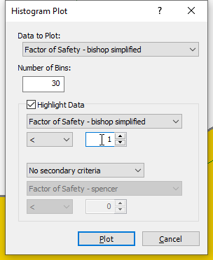
- Click Plot to generate the Histogram shown below.
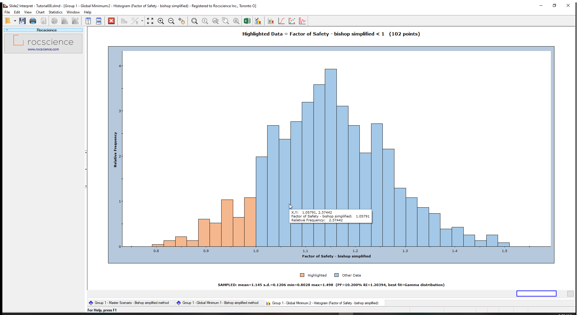
The legend immediately below the chart highlights FS<1 for the Bishop Simplified method in light orange bars. Statistics, such as mean and standard deviation, are displayed below the chart
To view the Best-Fit Distribution for the safety factors:
- Right-click on the histogram plot and select Best Fit Distribution from the popup menu.
The Best-Fit Distribution will be displayed on the Histogram. In this case, the best fit is a Gamma Distribution the parameters of which are listed at the bottom of the plot.
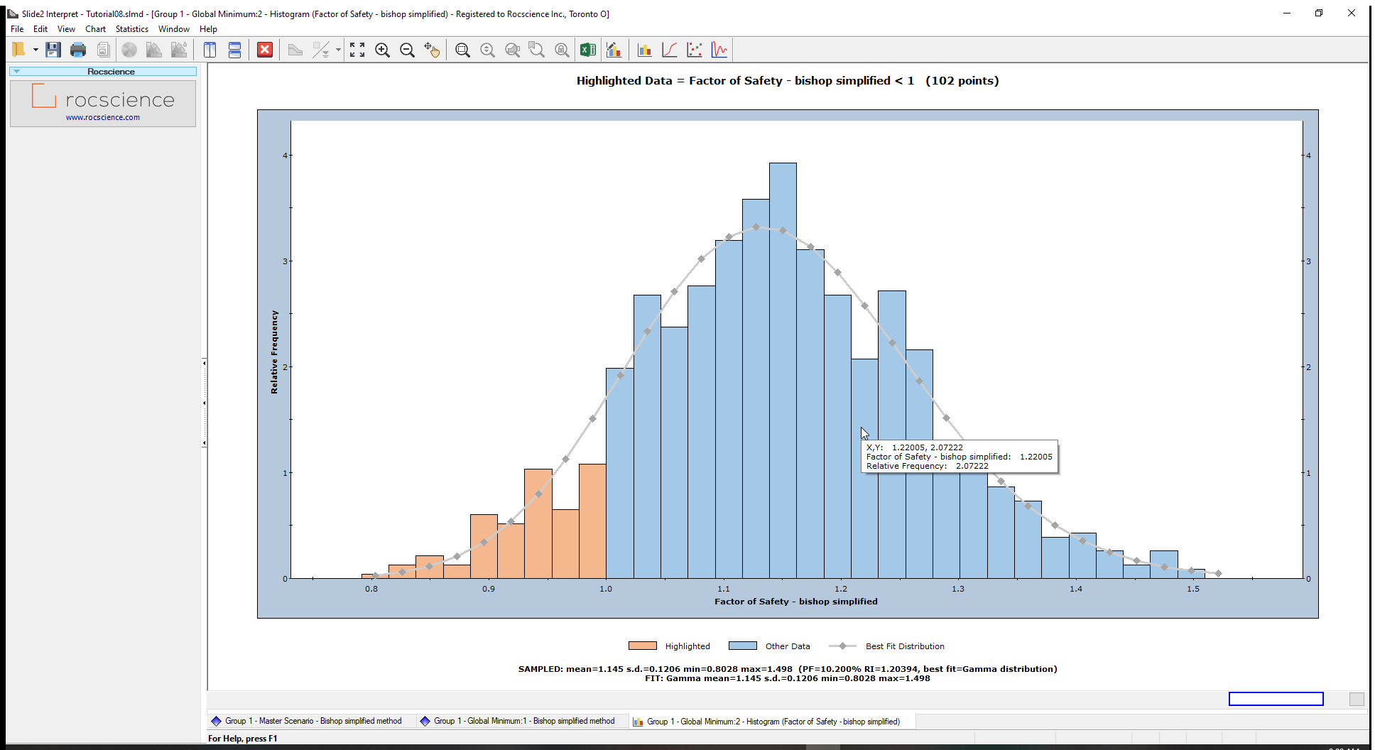
This curve can be turned on or off, by right-clicking on the plot, and toggling the Best-Fit Distribution option.
You can generate histogram plots for Spencer and GLE/Morgenstern-Price as an optional exercise.
We can also plot the distribution of samples generated for the input data random variable(s) used in a probabilistic analysis.
Let us create a histogram for the Cohesion random variable generated by the Latin Hypercube sampling.
- Right-click on the histogram and select Change plot data.
- Change the Data to Plot to Soil 1 : Cohesion and plot the data. (We will not change our highlighted criterion.)
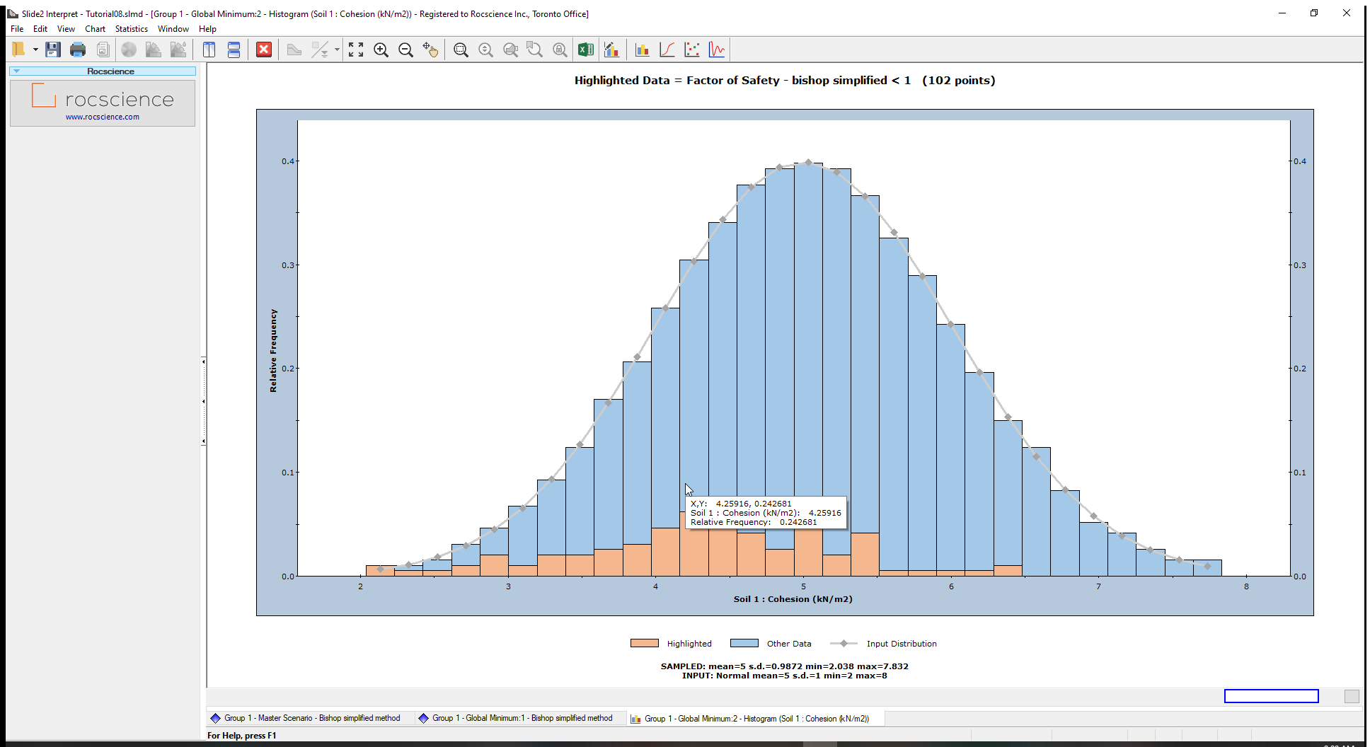
The plot shows the random samples generated by the Latin Hypercube sampling of the cohesion random variable.
Under the graph, we have the sampled statistics (raw data generated by the Latin Hypercube sampling of the input distribution) and the Input statistics (parameters you defined for the random variable, in the Material Statistics dialog)
Notice that the FS<1 bars are concentrated in the lower cohesion half of the histogram.
4.2 Cumulative Plots
A cumulative plot shows the cumulative probability that values of a random variable will be LESS THAN OR EQUAL TO a specified value.
Select the Cumulative Plot option from the toolbar or the Statistics menu to generate a Cumulative plot.
- Select Statistics > Cumulative Plot
 to open the Cumulative Plot dialog.
 - Select Factor of Safety – Bishop Simplified as the Data to Plot.
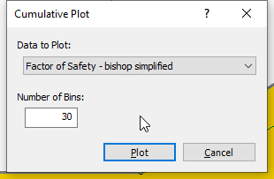
- Click Plot to create the cumulative plot of safety factors shown below.
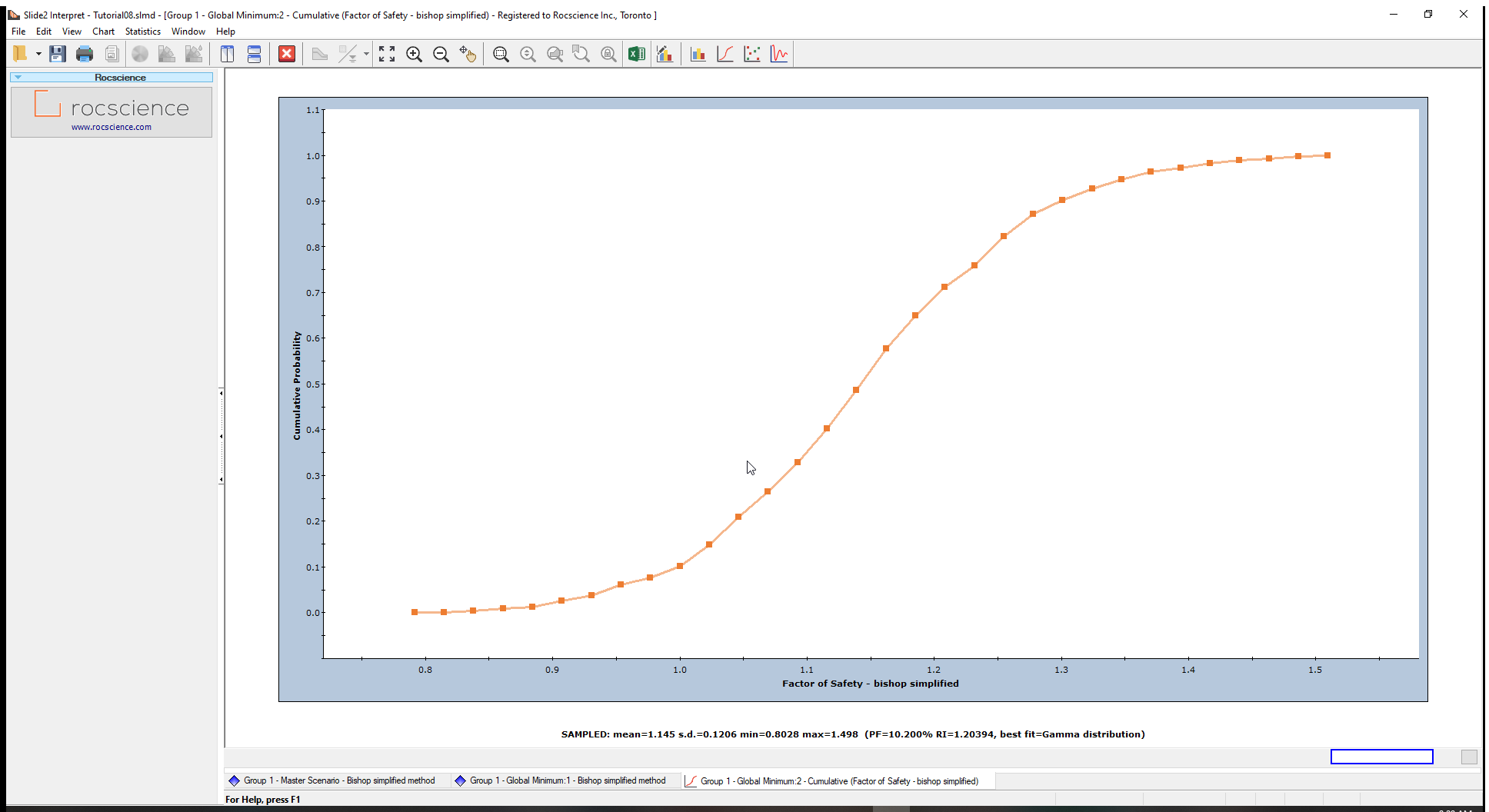
The Cumulative Probability at Safety Factor = 1 is the Probability of Failure (PF).
We can verify this by using the Sampler Option. The Sampler Option on a Cumulative Plot allows you to quickly determine the coordinates at any point along the Cumulative Distribution Curve.
To do this:
- Right-click on the Cumulative Plot and select Sampler > Show Sampler option.
The dotted cross-hair line (Sampler) will now show on the plot. As you move the mouse over the cumulative curve, the coordinates at those points are displayed on the Cumulative Plot curve. - Click the mouse at Factor of Safety = 1. The Cumulative Probability value will be the same as the Probability of Failure for the Bishop analysis we noted earlier in this tutorial.
4.3 Scatter Plots
Scatter Plots allow you to plot any two random variables against each other and analyze the relationships between them using a Correlation Coefficient.
A Correlation Coefficient close to 1 or -1 indicates a high degree of correlation whereas a Correlation Coefficient close to zero indicates little or no correlation.
We will use scatter plots to find the relationship between the following Friction Angle (Phi) and Safety Factor. To do this:
- Select: Statistics > Scatter Plot to open the dialog.
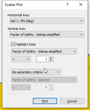
- Enter the following:
- Horizontal Axis: Soil 1: Phi (deg)
- Vertical Axis: Factor of Safety – bishop simplified
- Highlight Data: Factor of Safety – bishop simplified < 1
- Click on the Plot button to create the scatter plot below.
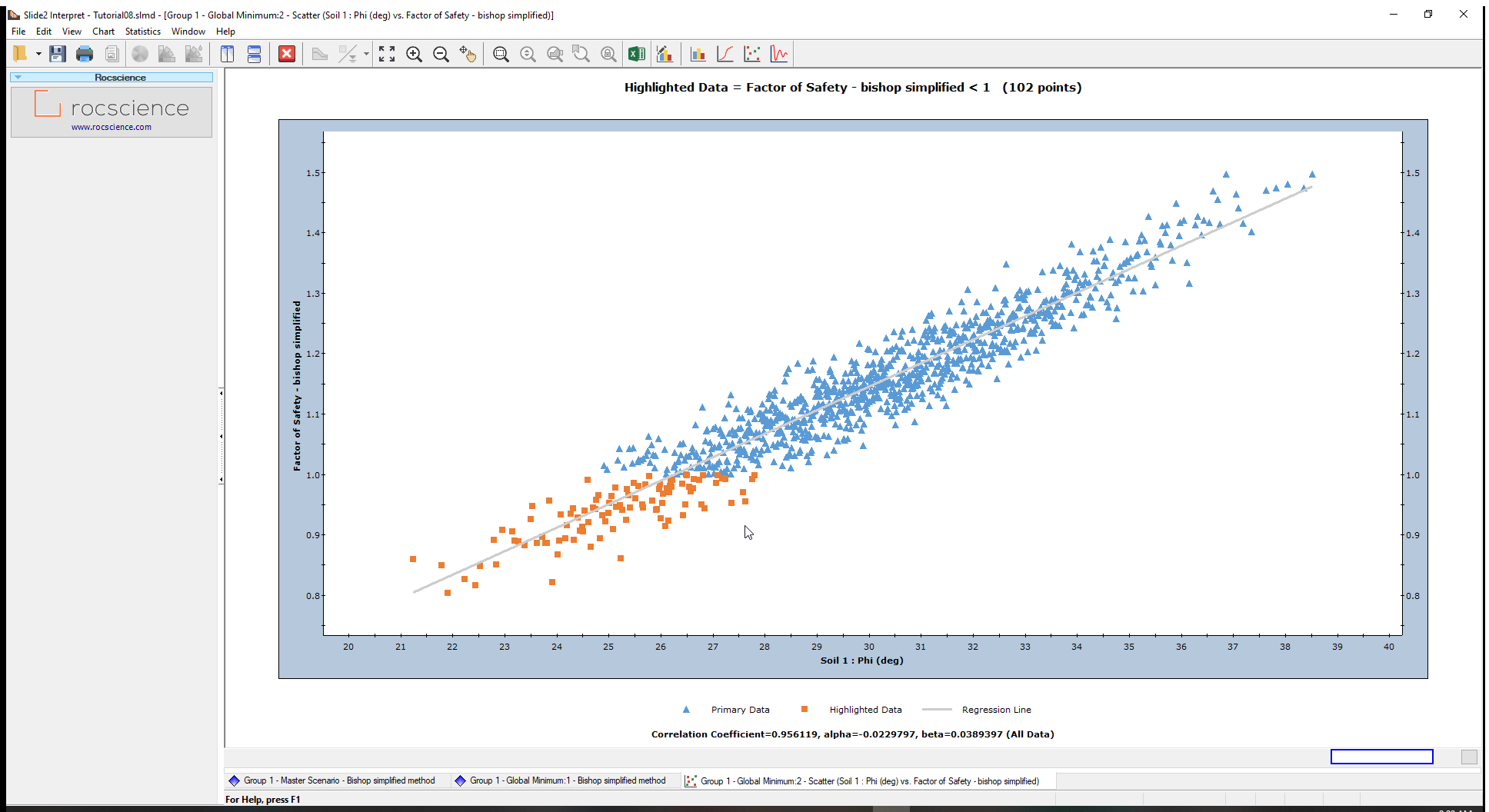
At the bottom of the plot, the Correlation Coefficient is approximately 1 indicating a high correlation between the Friction Angle (Phi) and the Safety Factor or Factor of Safety. In other words, as friction angle increases, factor of safety increases, as expected.
The parameters ‘alpha’ and ‘beta’ are the slope and y-intercept, respectively, of the best fit (linear) curve or Regression Line, to the data.
All data points with a Safety Factor less than 1(Highlighted data), are displayed on the Scatter Plot in orange.
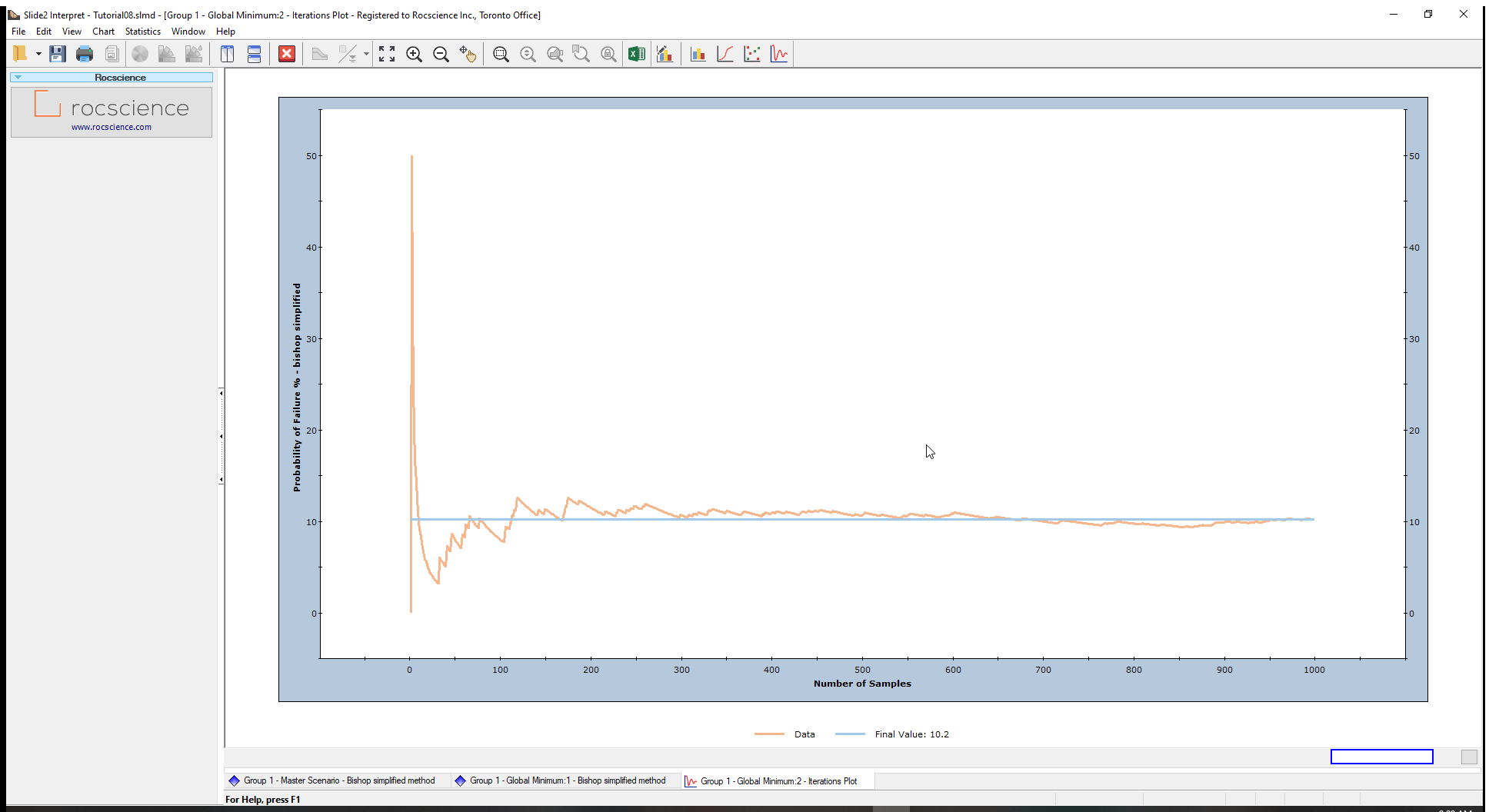
4.4 Convergence Plot
A Convergence Plot helps determine whether your results obtained from a Probabilistic Analysis (Probability of Failure, Mean Safety Factor, etc.) converge to a definitive answer, or whether more samples are required.
We will verify if our analysis’ Probability of Failure (PF) converges.
- Select Statistics > Convergence Plot
 to open the Convergence Plot dialog.
 - For Iteration Data
select Probability of Failure %.
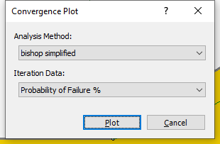
- Click the Plot button to see the ‘PF’ Convergence Plot.
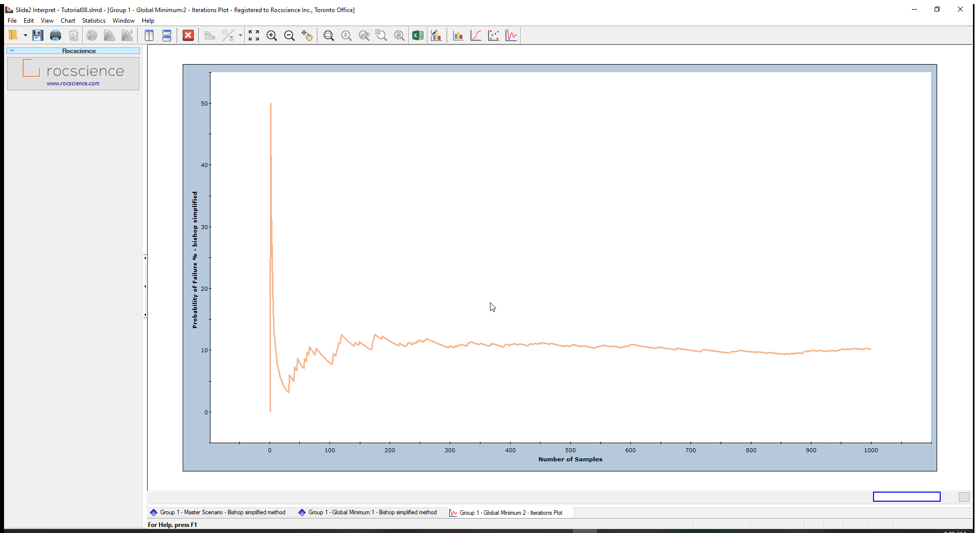
The plot above shows that the Probability of Failure has practically achieved a constant (steady state) value.
If the convergence plot indicates that you have not achieved a stable result, you should increase the ‘Number of Samples’ and re-run the analysis.
You can also view the final probability of failure value by:
- Right-clicking on the plot.
- Selecting the Final Value option from the popup menu.
A horizontal line will appear on the plot, representing the steady-state value. At the bottom of the chart, the Final value is given as 10.2 (the Probability of Failure calculated for the analysis).
To test this observation, increase the Number of Samples (e.g., 2000), and re-run the analysis as an optional exercise.
5.0 Additional Exercise
If you would like to experiment further with the Probabilistic Analysis modelling and data interpretation features in Slide2, try the following exercise:
5.1 Correlation Coefficient between Cohesion and Friction Angle
In the tutorial, there was no correlation defined between Cohesion and Friction Angle. Generally, materials with low Cohesion tend to have high Friction Angles, and vice versa.
In Slide2, the user can define a correlation coefficient for Cohesion and Friction Angle so that when the samples are generated, there will be a correlation between the two material properties.
To do this:
- Select the Statistics > Define Material
 option in the Slide2 Model program.
 - Click on the Correlation option in the Material Statistics dialog.
- In the correlation dialog, tick the checkbox under Apply heading for soil 1. We will use the default correlation coefficient of –0.5.
- Click OK in the Correlation and the Material Statistics dialogs.
- Re-compute the analysis and interpret results when computations are done.
- Create a Scatter Plot of Cohesion versus Friction Angle in the Slide2 Interpret window.
- Re-run the analysis using correlation coefficients of – 0.6, – 0.7, – 0.8, – 0.9, – 1.0.
- View a scatter plot of Cohesion versus Friction Angle, after each run.
This will display a dialog, that allows you to define a correlation coefficient between cohesion and friction angle (the “Advanced Correlation” button will allow for correlation coefficient input between any parameters, and any materials).
The Correlation Coefficient between Cohesion vs. Phi is – 0.5.
The Probability of failure decreases significantly, as the correlation between cohesion and friction angle increases (i.e., closer to –1).